MapTiler turns into an integrated family of products back in May and also got a fresh new visual design. It takes more than half a year from the first round of talks to the final image and here is the story behind to inspire and help others who are about to undertake the same journey.
From DIY to professional graphics contest
MapTiler was in urgent need of new visual design. The very first logo of MapTiler was done back in 2008 by the founder, Petr Pridal, using open-source graphics editor GIMP. As a non-designer, he broke all the graphics’ rules: the logo was monochromatic, with a shape reminding Windows instead of unique one, the map inside was too photorealistic and the details inside takes too long to be recognized as a map.
As we started to plan change MapTiler’s visual style last year in fall, as the company graphic designer, I was the very first person to be asked to create the new logo. I was familiar with all our products as a long-term member of the team. It turns out to be a significant advantage as well as a disadvantage: I was able to create designs to fit contemporary products, on the other hand, my involvement blocks me from seeing over the horizon.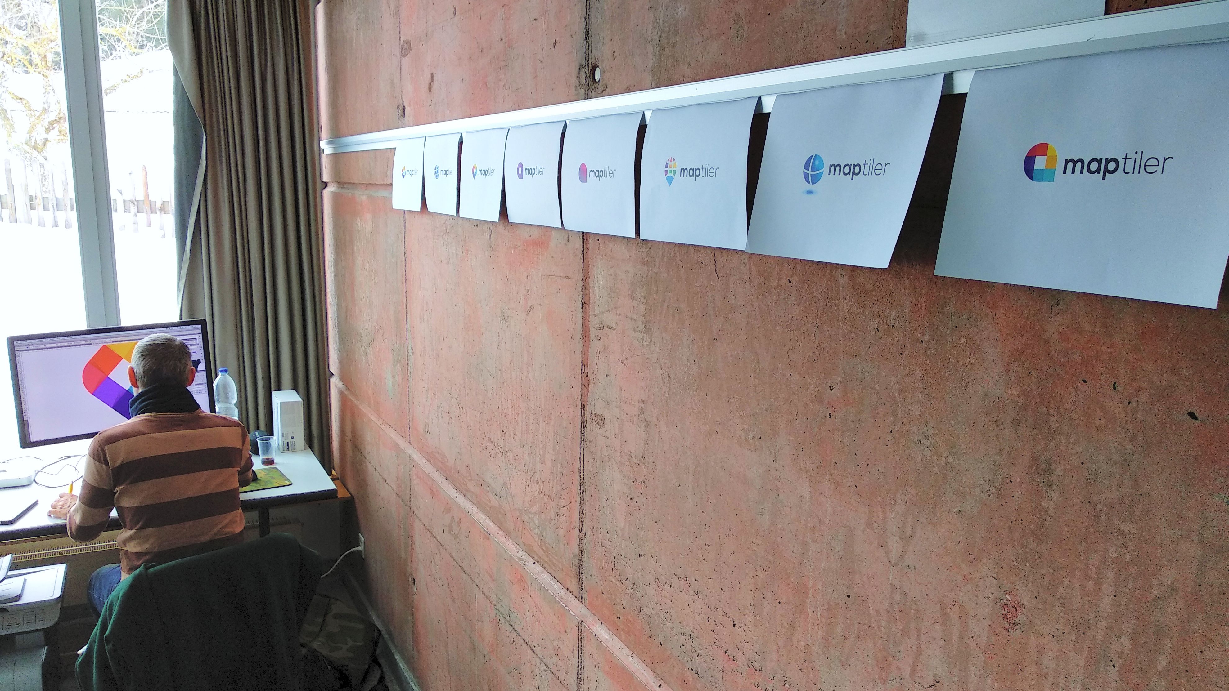
Graphics contest at 99designs.com
Therefore we decided to get inspiration at 99designs.com, which is a crowd-sourcing service for designers where for instance Docker gets its Moby-Dick icon. The contractor sends there a request with a description of what he/she wants and saves a deposit for the winner. After the set time, he/she will select the winner who gets the main financial price. Our instructions were the following:
MapTiler (or Maptiler) is desktop software for converting images and data into zoomable maps. We provide free detailed maps of the entire world which people can style and our customers process their satellite and drone imagery and business data, creating specialized maps for pilots, sailors, weather forecast, cellphone signal coverage, indoor plans, etc. MapTiler is launching a new cloud online service and mobile app — and we need a new logo suitable for the new family of products. For our work have a look at www.maptiler.com, www.maptiler.com/cloud/, www.openmaptiles.com, www.webglearth.com — but come with new fresh ideas, please!
We attached a sketch which symbolizes maps and tiles which we were using in our previous products and projects.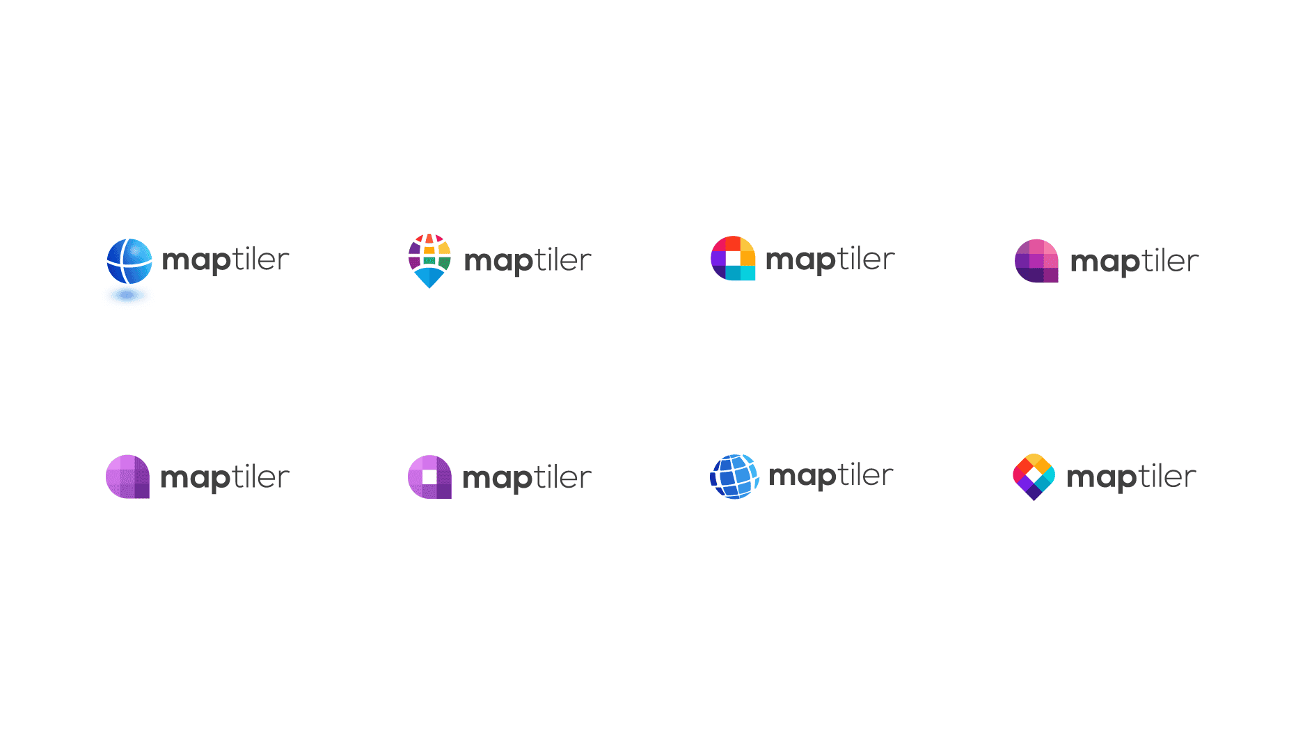
New logo
The tough part comes two weeks later after closing the contest. It was time to select one winner. But there was not few but many great designs! However, we can have only one logo and therefore we made our choice.
The winner was able to bring simple, but unique shape and combine it with a vibrant combination of colors, which we have not seen anywhere else. We also tested the logo with designated web tools and to our surprise, it found our logo and colors unique. The logo fulfill all designers’ rules.
Rules to follow for a successful logo
During the evaluation process, we adhere to the following rules:
- unique shape,
- easy to remember,
- simple (everybody should be able to draw it),
- scalable (works in smaller resolution, blurred, from a distance and in the black and white variation),
- with colors matching your brand.

Typography
Thinking about the design, all parts of your visual appearance should communicate the same message. The next step in our case was typography.
It starts with the logotype, which is closely tied to the logo. We want them to jointly give an impression of a young and fresh product, which is friendly to the users. Therefore we chose the Nexa font with round shapes.
For our headlines, we choose the Ubuntu font. This typeface later appears on our website, social media, business cards and in other printed materials.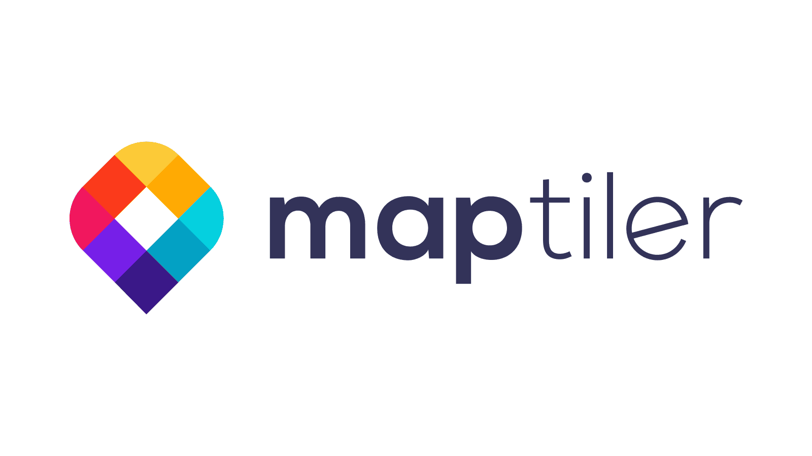
Web design
As said before, all parts of your image should communicate the same message. Therefore we decided to give our web a start-up facelift by using triangles and colors from our logo.
Each product has its color, which fits it best. Colors have been taken from the logo to represent where it comes from and also that all programs are communicating together. Also, all products get an icon telling what they do in a simplified way.
You can see the final design on MapTiler.com website.