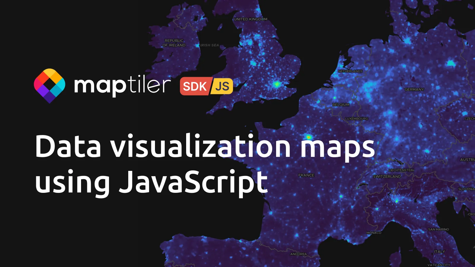
Dataviz is our basemap style designed to support your data on top while adding contextual information in the background. We have greatly improved the data behind the map to give you these key benefits:
- Improved content, with just the right amount of information at each zoom level
- Simplified layering for easier customization and integration of your data
- Clearer cartography, so you can see the relevant context without distracting from your data
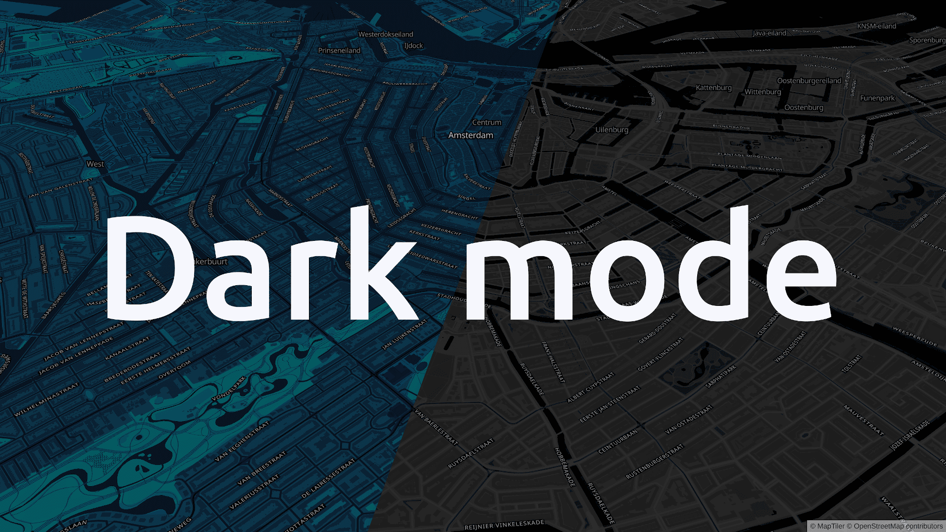
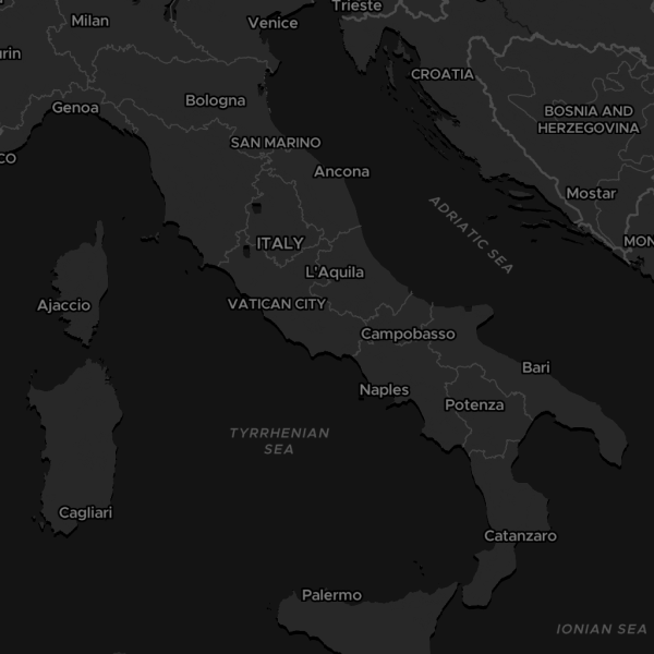
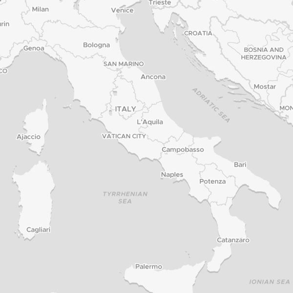
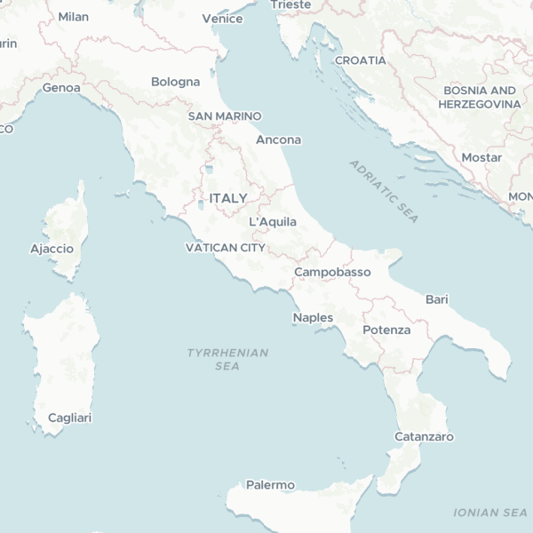
Dataviz comes in three variants: Dark, Light, and the Default, which has light pastel colors. Each one is designed to add important information to your data in the background in a subtle way.
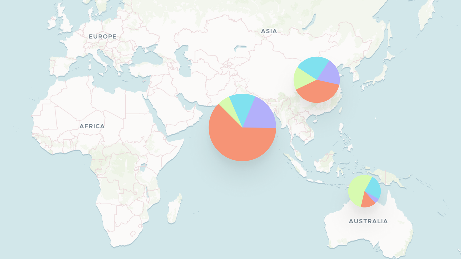
Whenever you need to visualise statistical or meteorological data, or highlight special POIs like charging stations, Dataviz is the first map style you should try. It sits in the background, adding context without diverting attention from the information you want to share.