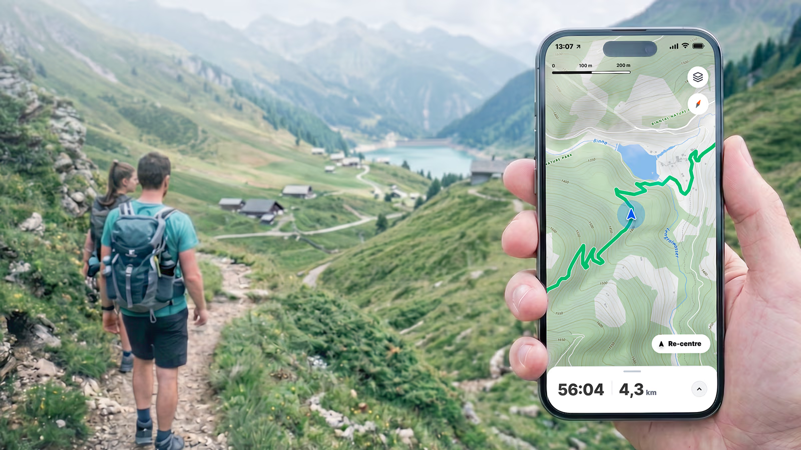
Contour lines are key to topographic maps, clearly showing the third dimension on a 2D surface. However, to be useful, map users must be able to interpret and read them correctly.
What are contour lines?
A contour line, also called a contour, connects points on a map that share the exact same elevation above (or below) sea level. They form enclosed lines of constant height.
Contours are spaced based on the elevation of the actual terrain. The higher the density of the contours, the steeper the slope; the lower the density, the flatter the terrain.
On digital maps, the interval between these lines varies by zoom level: at lower zoom levels, the interval is larger, and as you zoom in, the interval becomes smaller. Every fifth line (or every tenth at higher zoom levels) is called an index contour.
Index contours
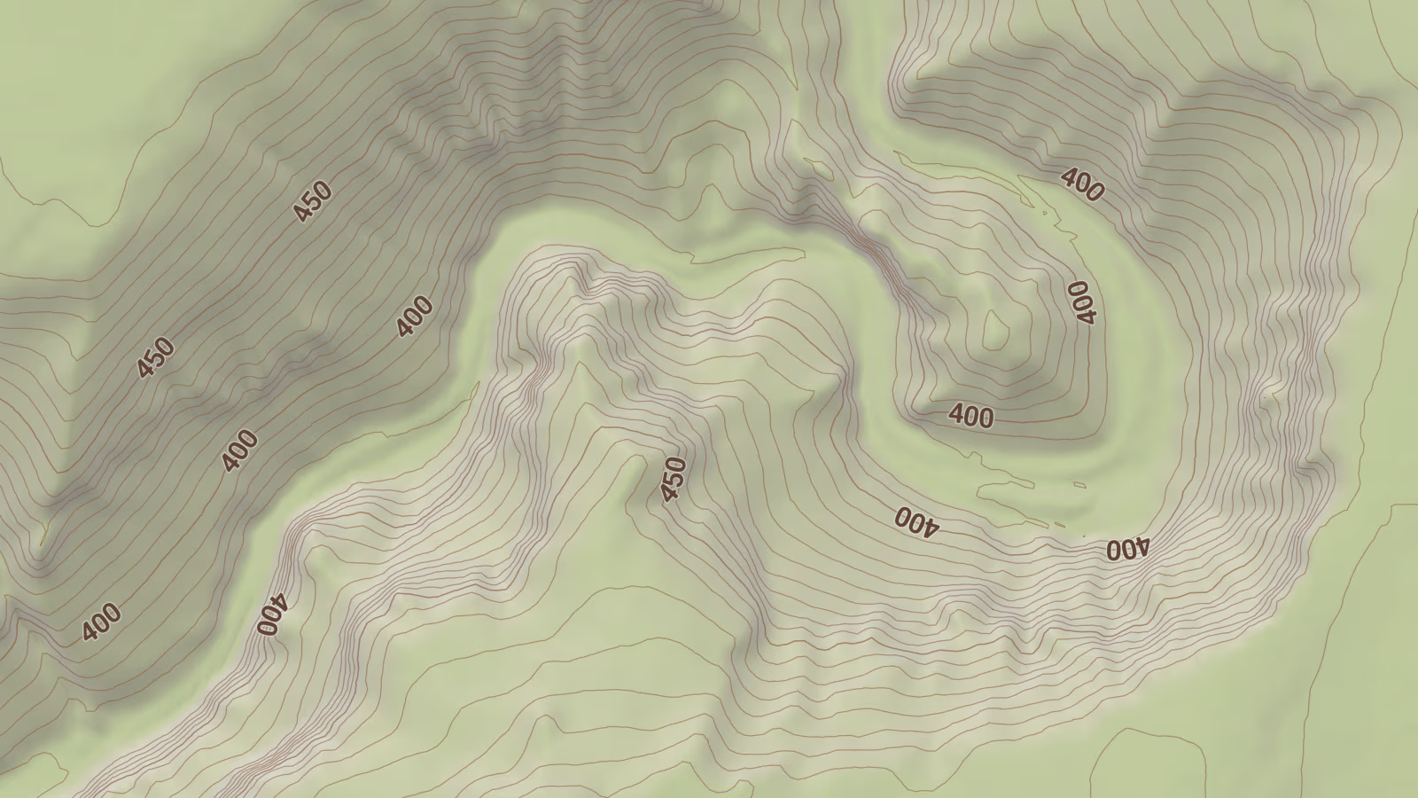
Index contours are highlighted lines that are more visible, either bold, darker, or both, and include a text label showing the exact elevation. They appear at equal intervals, typically every fifth contour line.
How to interpret contour lines
On traditional paper maps, contour labels used to point uphill. While many map providers keep this in the era of digital maps, you cannot rely on it because some map providers start turning the labels based on screen rotation.
You can also identify specific terrain features by their geometric shapes:
- Valleys: The contour lines form a "V" or "U" shape where the tip points toward higher ground.
- Ridges: The contour lines form a shape where the tip points toward lower ground.
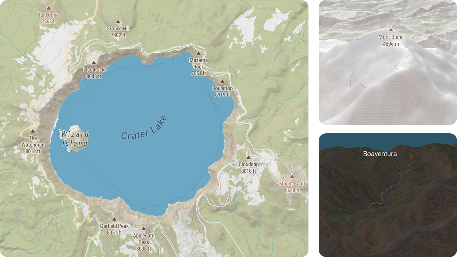
Another helpful feature is hillshading, which frequently accompanies contours on a map. It provides an immediate, visual hint of how the terrain changes.
Metric vs. imperial units
Traditional maps have contour labels in either metric or imperial units. Today, modern digital maps make it possible to support both. Vector tiles allow you to switch units and contours based on user preference.
Contours on glaciers and underwater
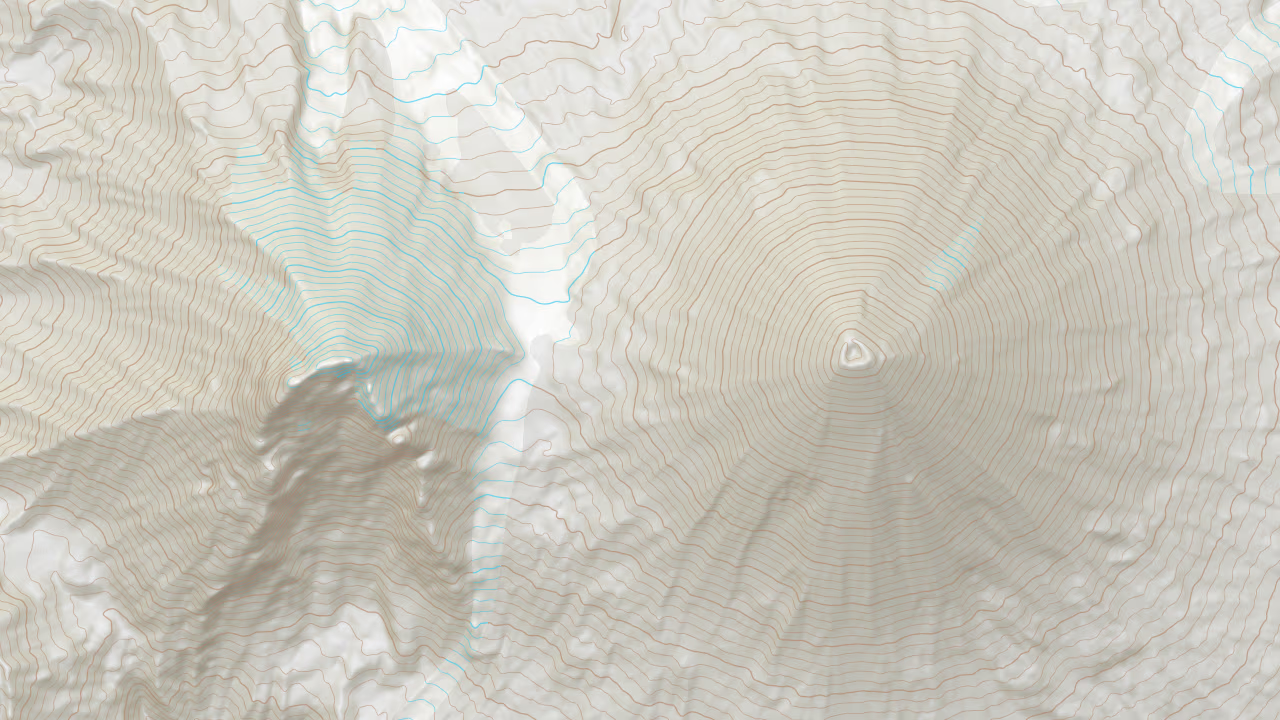
Maps often distinguish contours on glaciers for navigational needs. In reality, the terrain beneath a massive sheet of frozen water looks different, but because people walk on glaciers, showing the surface contours is highly useful. These lines are typically distinguished by a different color, usually blue.
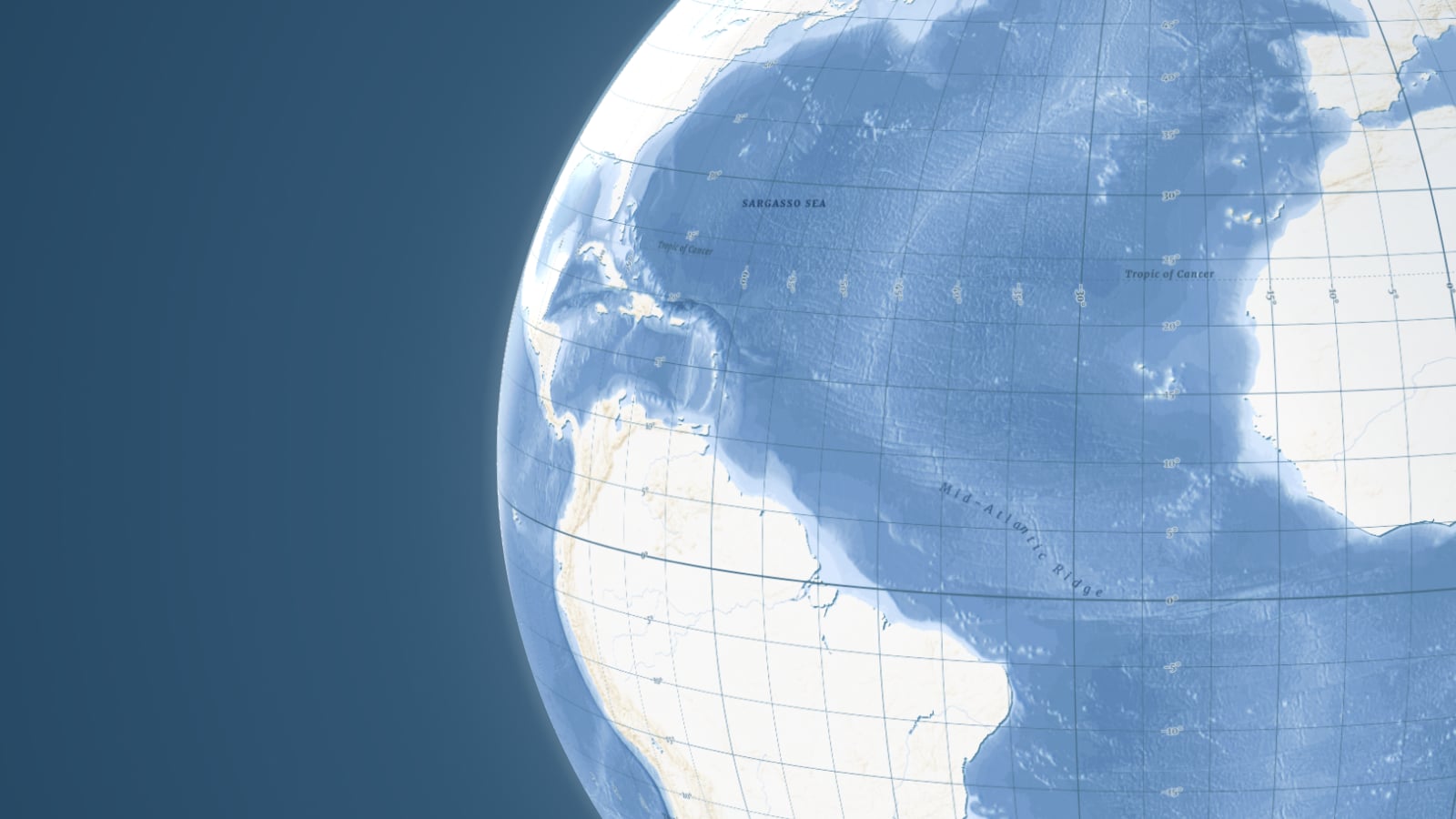
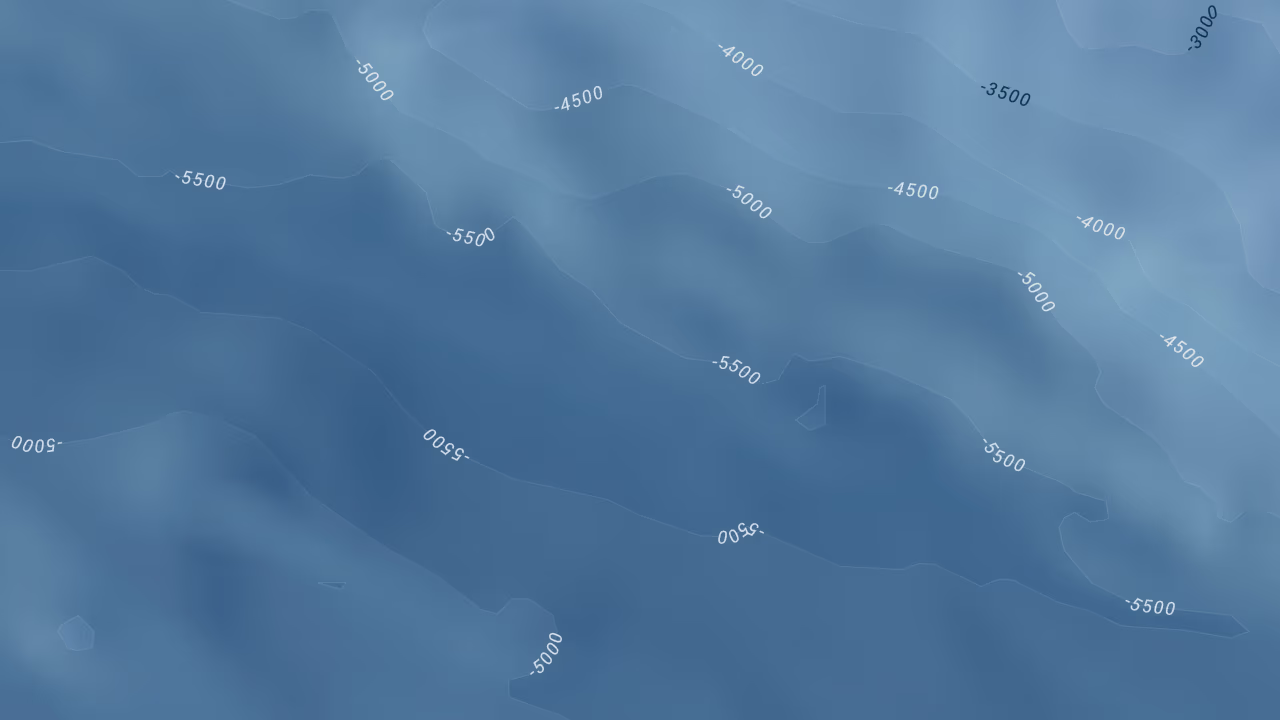
Another special case is underwater contours, or bathymetric contours to give them their scientific name. While it is rare to mix them with terrestrial contours in a single dataset, they are styled in the same way, though often with distinct colors to indicate water depth.
Combining contours with 3D terrain
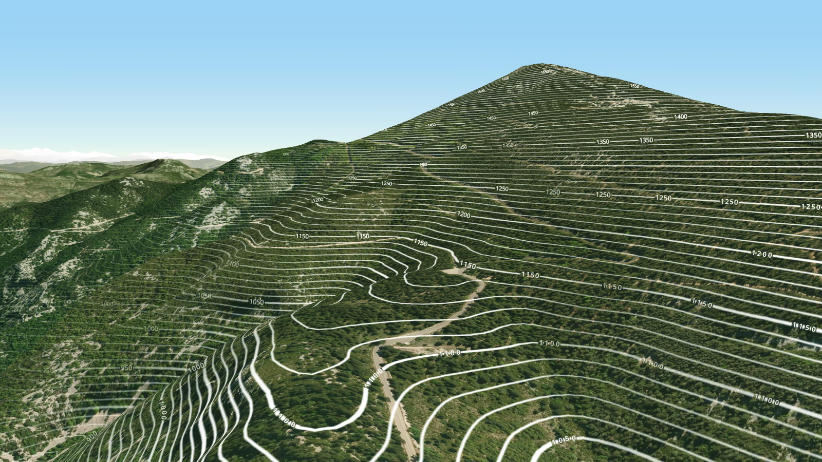
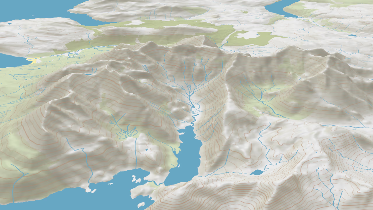
Even with this knowledge, some users still find it difficult to visualize terrain from a flat map. Combining contour lines with 3D terrain bridges this gap, as 3D rendering is intuitive for everyone to understand.
Therefore, the user gets a 3D visual of the land's shape as they would see it in the real world, and they also benefit from the precise height information shown by the contours, so they get an accurate sense of the landscape's scale.
Ready to integrate high-precision contour maps into your own applications?